
As cellular users continue to grow day in a day trip, they have an inclination to make more utilization of their cellular devices searching the internet and looking for inquiries. So it is essential to install the responsive widgets to your blogs in order to make your blog easy accessible for your visitors. In this post, we are going to share 9 responsive search bar designs for Blogspot blogs.
Check out: 7 Best Notification Bar Designs For BlogSpot Blogger
The search box is the basically an input text field with the massive collection of your published contents where a user types the preferred text to get it instantly if the content existed. So they don't need to browse your blog from very beginning to end which causes the consumption of their time and they start shouting at your blog. This post contained the 9 stylish search bars with attractive hover effects that you could install to your blogger site.
Recommended: CSS3 Transitions and Animations for Blogger BlogSpot
At the end of this tutorial. I have sorted out how to install these custom search bars to your blogger template.
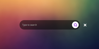
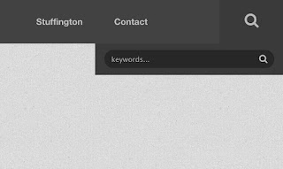
1. Css3 Animated Search Bar
Demo
Click here
Download
Click here
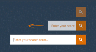
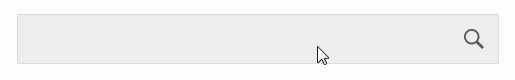
2. Expanding Search Bar
Demo
Click here
Download
Click here
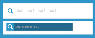
3. Search Bar Feat
Demo
Click here
Download
Click here
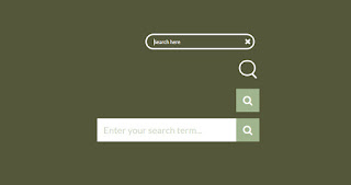
4. Smooth Expanding Search Bar
Demo
Click here
Download
Click here
5. Toggle Search Box Field
Demo
Click here
Download
Click here
6. Search Bar With Top to Bottom Hover
Demo
Click here
Download
Click here
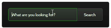
7. Animated Search Bar with Border Effects
Demo
Click here
Markup
<section class="webdesigntuts-workshop">CSS
<form action="/search" method="get">
<input autocomplete="off" name="q" placeholder="What are you looking for?" type="text" value="" /><button>Search</button>
</form>
</section>
<style type='text/css'>
@import url(http://fonts.googleapis.com/css?family=Cabin:400);
.webdesigntuts-workshop {
background: #151515;
height: 100%;
position: absolute;
text-align: center;
width: 100%;
}
.webdesigntuts-workshop:before {
background: #444;
background: -webkit-linear-gradient(left, #151515, #444, #151515);
background: -moz-linear-gradient(left, #151515, #444, #151515);
background: -o-linear-gradient(left, #151515, #444, #151515);
background: -ms-linear-gradient(left, #151515, #444, #151515);
background: linear-gradient(left, #151515, #444, #151515);
top: 192px;
}
.webdesigntuts-workshop:after {
background: #000;
background: -webkit-linear-gradient(left, #151515, #000, #151515);
background: -moz-linear-gradient(left, #151515, #000, #151515);
background: -o-linear-gradient(left, #151515, #000, #151515);
background: -ms-linear-gradient(left, #151515, #000, #151515);
background: linear-gradient(left, #151515, #000, #151515);
top: 191px;
}
.webdesigntuts-workshop form {
background: #111;
background: -webkit-linear-gradient(#1b1b1b, #111);
background: -moz-linear-gradient(#1b1b1b, #111);
background: -o-linear-gradient(#1b1b1b, #111);
background: -ms-linear-gradient(#1b1b1b, #111);
background: linear-gradient(#1b1b1b, #111);
border: 1px solid #000;
border-radius: 5px;
box-shadow: inset 0 0 0 1px #272727;
display: inline-block;
font-size: 0px;
margin: 150px auto 0;
padding: 20px;
position: relative;
z-index: 1;
}
.webdesigntuts-workshop input {
background: #222;
background: -webkit-linear-gradient(#333, #222);
background: -moz-linear-gradient(#333, #222);
background: -o-linear-gradient(#333, #222);
background: -ms-linear-gradient(#333, #222);
background: linear-gradient(#333, #222);
border: 1px solid #444;
border-radius: 5px 0 0 5px;
box-shadow: 0 2px 0 #000;
color: #888;
display: block;
float: left;
font-family: 'Cabin', helvetica, arial, sans-serif;
font-size: 13px;
font-weight: 400;
height: 40px;
margin: 0;
padding: 0 10px;
text-shadow: 0 -1px 0 #000;
width: 200px;
}
.ie .webdesigntuts-workshop input {
line-height: 40px;
}
.webdesigntuts-workshop input::-webkit-input-placeholder {
color: #888;
}
.webdesigntuts-workshop input:-moz-placeholder {
color: #888;
}
.webdesigntuts-workshop input:focus {
-webkit-animation: glow 800ms ease-out infinite alternate;
-moz-animation: glow 800ms ease-out infinite alternate;
-o-animation: glow 800ms ease-out infinite alternate;
-ms-animation: glow 800ms ease-out infinite alternate;
animation: glow 800ms ease-out infinite alternate;
background: #222922;
background: -webkit-linear-gradient(#333933, #222922);
background: -moz-linear-gradient(#333933, #222922);
background: -o-linear-gradient(#333933, #222922);
background: -ms-linear-gradient(#333933, #222922);
background: linear-gradient(#333933, #222922);
border-color: #393;
box-shadow: 0 0 5px rgba(0,255,0,.2), inset 0 0 5px rgba(0,255,0,.1), 0 2px 0 #000;
color: #efe;
outline: none;
}
.webdesigntuts-workshop input:focus::-webkit-input-placeholder {
color: #efe;
}
.webdesigntuts-workshop input:focus:-moz-placeholder {
color: #efe;
}
.webdesigntuts-workshop button {
background: #222;
background: -webkit-linear-gradient(#333, #222);
background: -moz-linear-gradient(#333, #222);
background: -o-linear-gradient(#333, #222);
background: -ms-linear-gradient(#333, #222);
background: linear-gradient(#333, #222);
-webkit-box-sizing: content-box;
-moz-box-sizing: content-box;
-o-box-sizing: content-box;
-ms-box-sizing: content-box;
box-sizing: content-box;
border: 1px solid #444;
border-left-color: #000;
border-radius: 0 5px 5px 0;
box-shadow: 0 2px 0 #000;
color: #fff;
display: block;
float: left;
font-family: 'Cabin', helvetica, arial, sans-serif;
font-size: 13px;
font-weight: 400;
height: 40px;
line-height: 40px;
margin: 0;
padding: 0;
position: relative;
text-shadow: 0 -1px 0 #000;
width: 80px;
}
.webdesigntuts-workshop button:hover,
.webdesigntuts-workshop button:focus {
background: #292929;
background: -webkit-linear-gradient(#393939, #292929);
background: -moz-linear-gradient(#393939, #292929);
background: -o-linear-gradient(#393939, #292929);
background: -ms-linear-gradient(#393939, #292929);
background: linear-gradient(#393939, #292929);
color: #5f5;
outline: none;
}
.webdesigntuts-workshop button:active {
background: #292929;
background: -webkit-linear-gradient(#393939, #292929);
background: -moz-linear-gradient(#393939, #292929);
background: -o-linear-gradient(#393939, #292929);
background: -ms-linear-gradient(#393939, #292929);
background: linear-gradient(#393939, #292929);
box-shadow: 0 1px 0 #000, inset 1px 0 1px #222;
top: 1px;
}
@-webkit-keyframes glow {
0% {
border-color: #393;
box-shadow: 0 0 5px rgba(0,255,0,.2), inset 0 0 5px rgba(0,255,0,.1), 0 2px 0 #000;
}
100% {
border-color: #6f6;
box-shadow: 0 0 20px rgba(0,255,0,.6), inset 0 0 10px rgba(0,255,0,.4), 0 2px 0 #000;
}
}
@-moz-keyframes glow {
0% {
border-color: #393;
box-shadow: 0 0 5px rgba(0,255,0,.2), inset 0 0 5px rgba(0,255,0,.1), 0 2px 0 #000;
}
100% {
border-color: #6f6;
box-shadow: 0 0 20px rgba(0,255,0,.6), inset 0 0 10px rgba(0,255,0,.4), 0 2px 0 #000;
}
}
@-o-keyframes glow {
0% {
border-color: #393;
box-shadow: 0 0 5px rgba(0,255,0,.2), inset 0 0 5px rgba(0,255,0,.1), 0 2px 0 #000;
}
100% {
border-color: #6f6;
box-shadow: 0 0 20px rgba(0,255,0,.6), inset 0 0 10px rgba(0,255,0,.4), 0 2px 0 #000;
}
}
@-ms-keyframes glow {
0% {
border-color: #393;
box-shadow: 0 0 5px rgba(0,255,0,.2), inset 0 0 5px rgba(0,255,0,.1), 0 2px 0 #000;
}
100% {
border-color: #6f6;
box-shadow: 0 0 20px rgba(0,255,0,.6), inset 0 0 10px rgba(0,255,0,.4), 0 2px 0 #000;
}
}
@keyframes glow {
0% {
border-color: #393;
box-shadow: 0 0 5px rgba(0,255,0,.2), inset 0 0 5px rgba(0,255,0,.1), 0 2px 0 #000;
}
100% {
border-color: #6f6;
box-shadow: 0 0 20px rgba(0,255,0,.6), inset 0 0 10px rgba(0,255,0,.4), 0 2px 0 #000;
}
}
</style>
8. Search Bar With Expanding Effect on Click

Demo
Click here
Markup
<div id="main">CSS
<form id="searchForm" action="/search">
<fieldset>
<div class="input">
<input type="text" name="q" id="s" placeholder="Enter your search" />
</div>
<input type="submit" id="searchSubmit" value="" />
</fieldset>
</form>
</div>
<style type='text/css'>
fieldset, form, label, legend,
table, caption, tbody, tfoot, thead, tr, th, td,
article, aside, canvas, details, figcaption, figure,
footer, header, hgroup, menu, nav, section, summary,
time, mark, audio, video {
margin: 0;
padding: 0;
border: 0;
font: inherit;
vertical-align: baseline;
}
/*-------------
SEARCH
-------------*/
#searchForm fieldset {
width:240px;
position:relative;
display:block;
}
div.input {
width:120px;
padding:5px 15px 7px 15px;
border-radius:20px;
border:1px solid #c6d2db;
border-top:1px solid #b4c1cb;
box-shadow:inset 0 1px 2px rgba(0,0,0,0.08);
float:right;
background:#e8edf1;
}
div.input.focus {
border:1px solid #9ecbe2;
box-shadow:0 0 6px #abdcff, inset 0 1px 2px rgba(0,0,0,0.08);
}
input#s {
width:100%;
border:0;
border-radius:20px;
background:transparent;
height:16px;
color:#b4bdc4;
text-shadow:0 1px 1px #fff;
}
input#s:focus {
outline:none
}
input#searchSubmit {
width:19px;
height:19px;
text-indent:-9999px;
overflow:hidden;
background:url(../images/search-icon.png) no-repeat;
border:0;
position:absolute;
top:7px; right:13px;
z-index:5;
display:none;
cursor:pointer;
}
</style>
JQuery
<script src="http://ajax.googleapis.com/ajax/libs/jquery/1.5.1/jquery.min.js"></script>
<script src="http://pastebin.com/raw.php?i=J6Kpa2Pf"></script>
<script src="http://pastebin.com/raw.php?i=yu6FUA1L"></script>
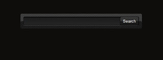
9. Dark Search Bar
Demo
Click here
Download
Click here
How to Install Custom Search Bar to Blogger Template
- Login to your blogger Dashboard > Edit HTML
- Click inside the template Editor
- Press Ctrl + F to open the search box within the template editor
- Search for ]]></b:skin> and paste the CSS just before/above it
- Delete <style type='text/css'> and </style> in custom CSS
- Next, find the </head> and paste the JQuery right before/above it
- Now paste the Markup where you want to display the search bar
- Click save template and you are done
Conclusion
Search box helps the visitors for find the targeted tutorials or widgets within your blogger
site. If you've not yet installed the search bar, I suggest, you add the mentioned widgets right now and let the readers to stay on your blog without leaving it instantly.


hey bro....i like your site so much..can you please tell me the process of adding sticky/floating menu bar which you have added in your blog which includes blogging,downloads etc...thanks
ReplyDelete@Sohail i have already published a tutorial pls visit HERE
Delete